Healthline Link Preview
Previewing links to users to show them supplementary information to help them enhance their reading comprehension and get the answers to their health problems faster.
Problem
Users believe that articles on Healthline.com are long and dense, making it hard for them to comprehend what they are reading and get the answers to their health problems resolved. This is further hurt when they come across a word or phrase not fully explained by the article, and the user must leave the page to understand it further—ending with the user either forgetting about the original article or being unable to find it.
Solution
Users need a way to quickly view supplementary information to help them enhance their reading comprehension and build trust in the Healthline brand without opening a new tab or window and not causing article content to be pushed down the page.
Process
As my team was testing adding different trusted information to various Healthline.com articles, we noticed that if we added any information to the bottom, only about 4-5% of users reached it. And if we added more details to the top, our SEO rankings would be negatively impacted. So we needed to think of a way to help our users as they read without pushing our article content down.
Research & Competitive Analysis
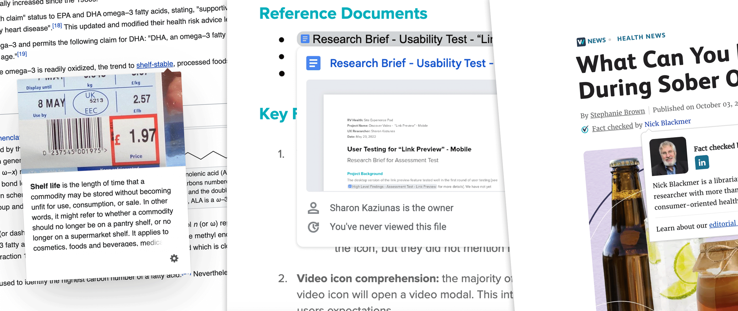
To better understand how to proceed, we looked at what others were doing to serve up information to their users. Within the health space, we noticed competitors like VeryWellHealth.com are currently using click states on mobile and hover states on desktop to service byline-specific information to their users but nothing within their articles. At the same time, websites like Wikipedia and Google Drive use a preview modal that contains information on the next page when hovering over a hyperlink on desktop.
Phase1: Link Preview
Taking inspiration from our competitors’ link preview modals, I audited Healthline’s current components to see what could be used to quickly create prototypes for testing to see if the link preview was viable.
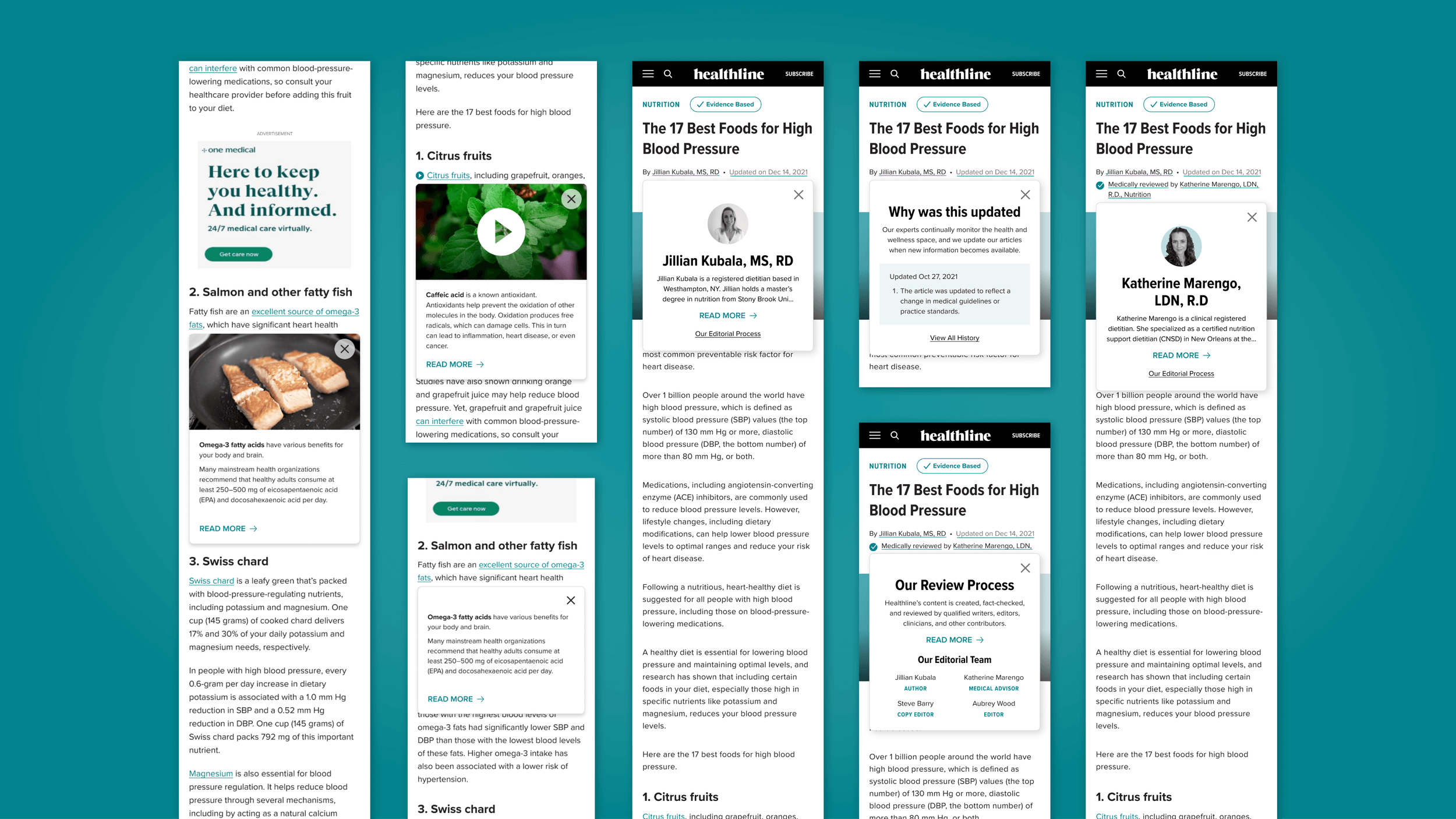
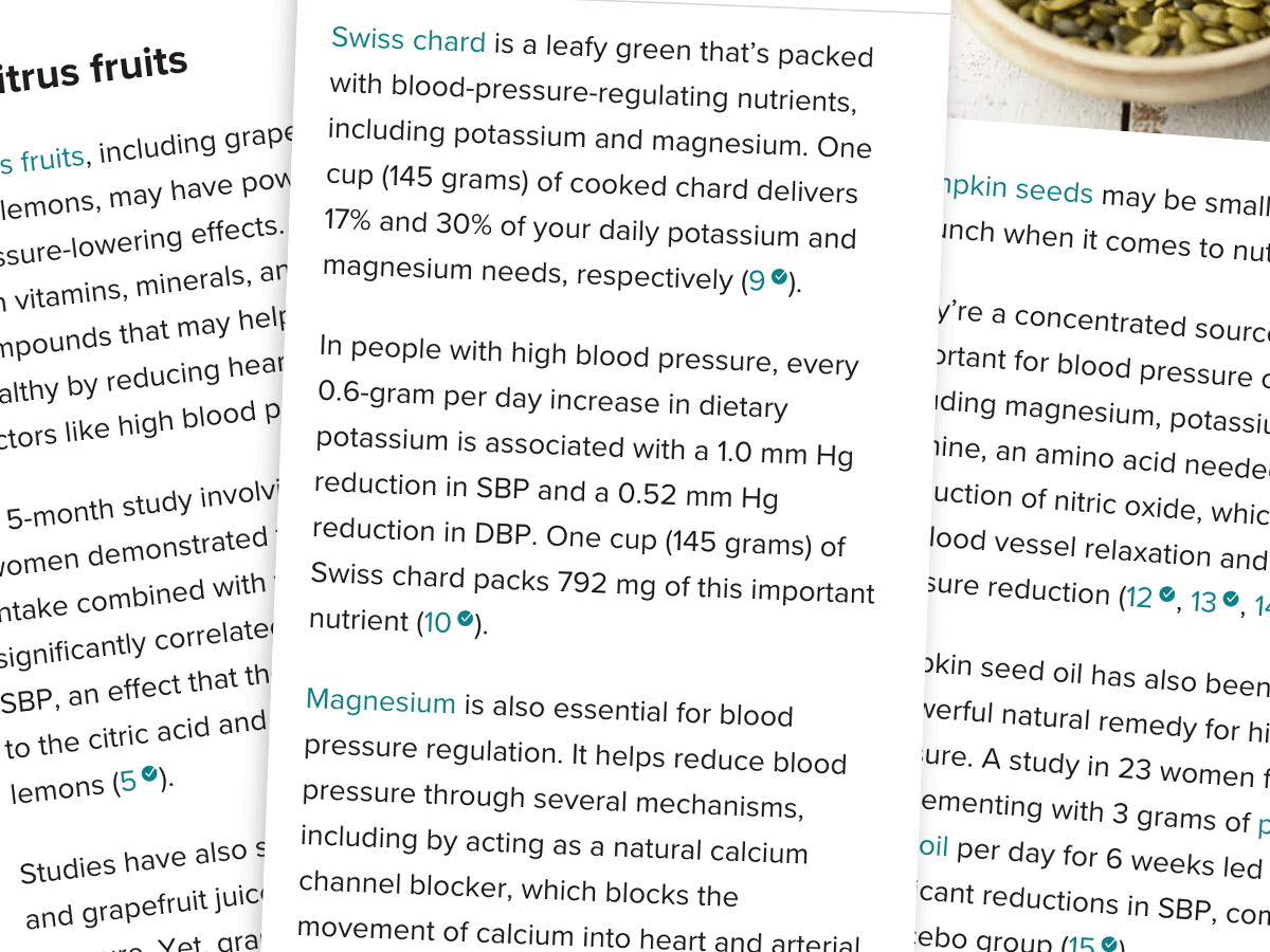
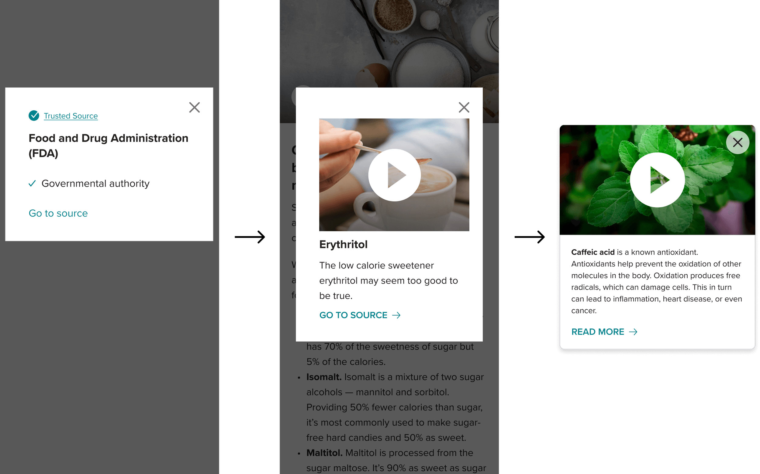
Healthline was already using a popup modal within our articles for trusted sources. This modal provides users with the source and why Healthline trusts it to build trust in the content that has been written. This trusted source modal also had an option for mobile and desktop, allowing it to be a good base for my designs.
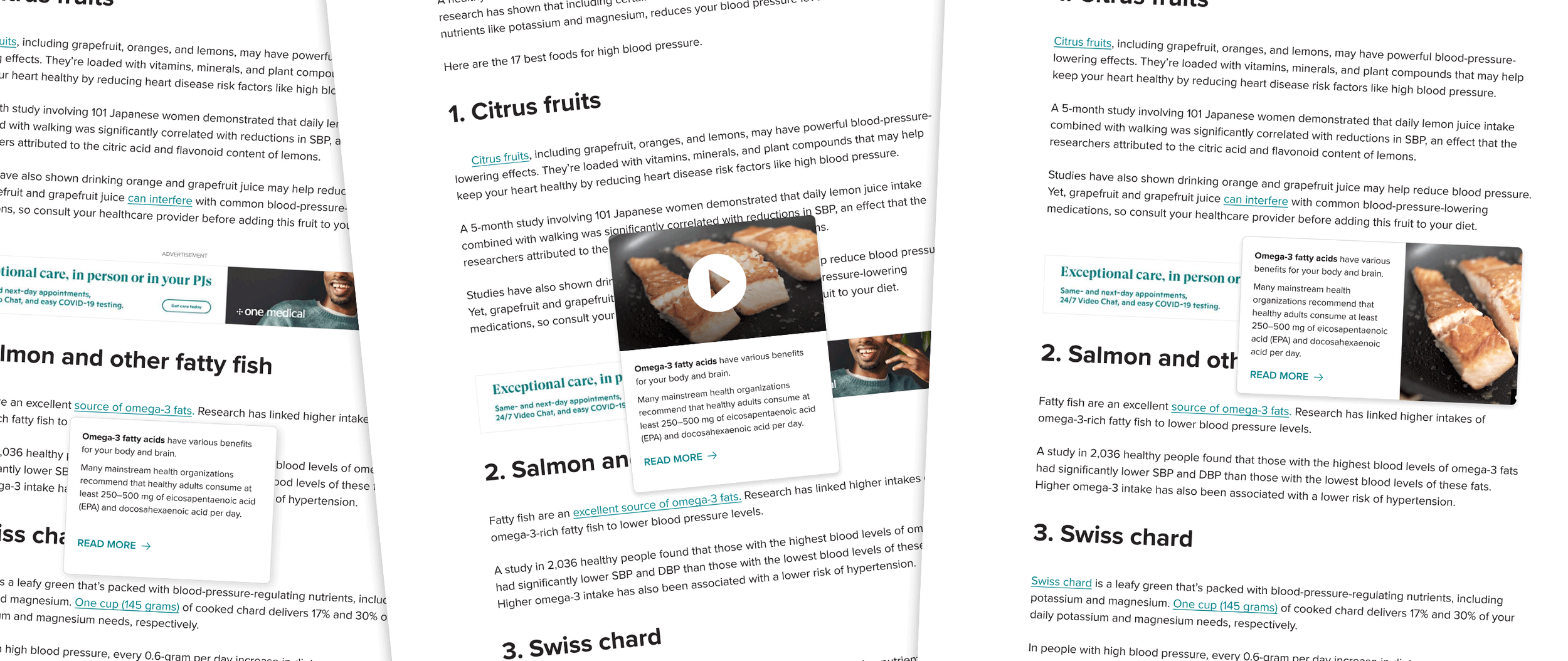
From there, I modified the trusted source modal to accommodate the functions we envisioned for the final product. I was adding imagery and video options to the modal as well as thought on how better to handle at least a paragraph of informational text. I wanted to make sure we could fit enough information to ensure it would be educational to our users but without making it too large to be distracting.
Prototype User Testing
The team conducted user tests on a small sample size of 5 users through usertesting.com. Are goals in this initial testing were twofold. We were looking to identify the strengths and weaknesses of the two design prototypes to help guide design decisions, determine the usability challenges for this feature on mobile and recommend improvements.
Due to the prototype's limited functionalities, some functions were tested, making it hard for users to understand. However, we did have strong signals that users did not know that the modal was there, it overlooked the pop-up even when we added an icon to denote a popup, and even though they did not notice it, most participants found the pop-up valuable when prompted. It enabled them to get more information without opening a new tab, losing their place on the page, or forgetting to look up the information in the new tab.
Alterations & Specs
With mostly positive feedback from our user tests, we decided to continue moving forward. I took the actionable feedback from the tests to further optimize my designs. Making sure to keep the read more cta at the bottom to convey there is more to read.
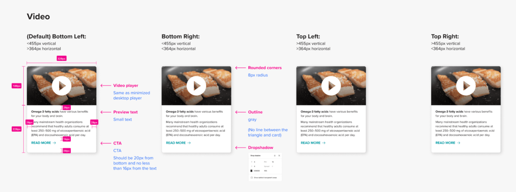
After that, I created different spec sheets for my engineering team to understand exactly how I wanted the modal designed and how it should function. The pop-up needing to appear in different placements depending on the location of the link within the article and how the user’s screen is positioned to make sure the modal is as centered as possible.
Live Site User Testing
After engineering coded the modal across a select few of Healthline’s top-performing articles onsite, my team held more in-depth user tests that were not barred with limitations like the prototype testing was. We surveyed 43 users, both male and female, ranging from 19-60 years old
'“The popup was extremely useful in helping me understand the information in the article”
“The pop-up helps a lot, it goes into detail that isn’t neccesarily apart of the article
“I liked the reading option with the pop-up. It was good. It was clear. I could read at my pace. It helped me scan the page. it was fast”
Phase 2: Byline Modal
As the engineering team coded the link preview, I proposed creating additional use cases for the modal to add value to it from a business perspective.
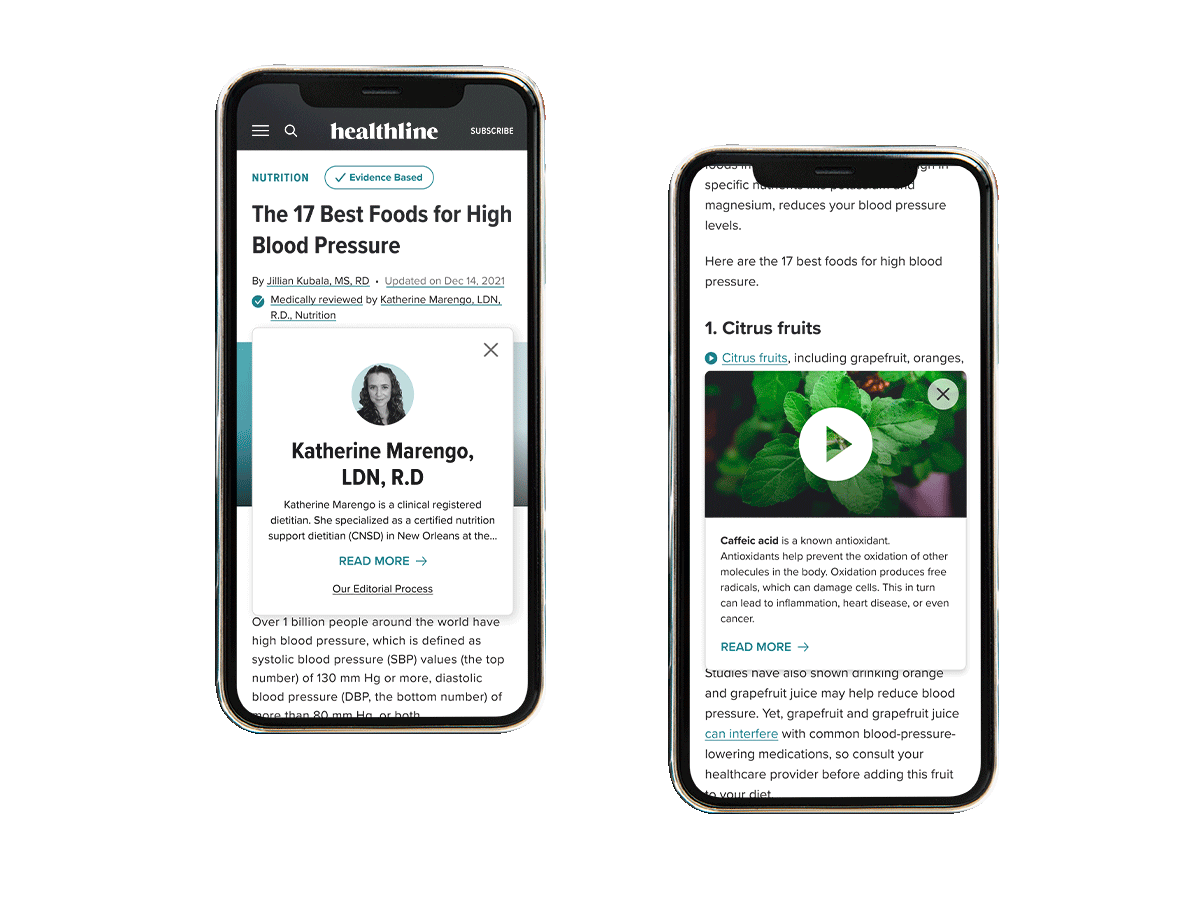
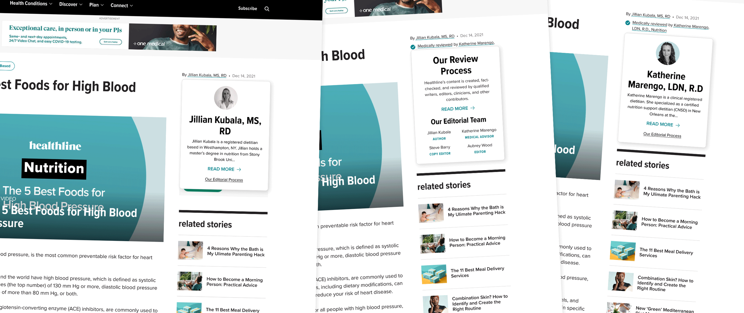
Like with VeryWellHealth.com, I created modal overlays for the different pieces of our byline, the author, the medical reviewer, our review process, and the reason an article is updated. These modals were implemented to eliminate space at the top of our articles that negatively impact our SEO ranking while providing large pieces of information to build trust in our content with our users. The pop-ups for the author and medical reviewer provide an image name, title, and small blurb containing their qualifications. The review process shows a blurb about Healthline’s article vetting and the terms of the four individuals that contributed to the creation. Finally, when an article is updated, there is always a reason behind it, be it an FDA update or new information being discovered is recorded here while also linking a user to the entire history that the article has gone through.
Conclusion
Phases 1 and 2 of the popup modal are live on-site, be it only on a few critical articles. We are currently testing how each type of modal will impact our SEO rankings as we hypothesize that they should either stay the same or it would be even better if they improve. We are also surveying visitors to measure trust in our articles and see if there is a difference in those with or without the modals. Again we hope that scores will improve and that those coming to our site see value in the extra information provided and make us more reputable in their minds.
If these metrics do prove positive, we will push to have the modals across all articles on-site. If not through, we will roll the test back and remove all the models from phases 1 and 2. From there, we will start brainstorming again about how we can add trust to Healthline’s articles and as a brand.
However, I believe that this is just the beginning of our link preview pop-up and that it has potential past the use cases for links and byline. Our product reviews and roundups could benefit, as users could learn more about an item they care about without being overwhelmed by those they don’t. As well as giving context to Healthline’s series and awareness campaigns they promote throughout the year.